Price comes first
Pricing flights was the most common reason participants visited an airline website or application. Price was also rated as one of the strongest factors when choosing an airline.
 SELECTED WORK · 2026

Travellers need a faster, more transparent way to compare prices and complete a booking.
I conducted an online survey to understand how people currently use airline websites and applications, what matters most when booking flights, and where friction exists within the booking experience.
View survey in Figma ↗Participants
Usually purchase directly from airlines
Typically fly for leisure or personal travel
Never pay extra to select a seat
KEY FINDINGS
Pricing flights was the most common reason participants visited an airline website or application. Price was also rated as one of the strongest factors when choosing an airline.
64.7% of participants said they usually purchase tickets directly from the airline, compared with 29.4% using travel websites.
64.7% said they never pay an additional fee to select a seat, showing clear resistance to optional booking charges.
When participants were asked how airline booking could be improved, reducing the number of steps was the most common response, followed by greater transparency around hidden fees.
SURVEY DATA
Ten questions completed by 17 participants.
01When did you last visit an airline website or app?
02What age group do you belong to?
03Why did you visit the app that day?
04Were you able to complete your task?
88.2%answered yes
05How do you usually purchase airline tickets?
06For what reason do you typically fly?
100%personal or leisure travel
07How often do you pack less to avoid baggage fees?
08How often do you pay additional fees to select your seat?
09What matters most when choosing an airline?
10How could airline booking be improved?
WHAT I LEARNED
The research showed that users primarily approach airline products with a clear focus on price and completing a booking efficiently. Additional charges — particularly around baggage and seat selection — can introduce friction, while fewer steps and clearer pricing were recurring opportunities for improvement.
These findings established three principles for the NAVX experience: make pricing easy to understand, keep optional extras transparent, and reduce unnecessary friction throughout the journey from discovery to booking.
COMPETITIVE RESEARCH
Comparing competitors helped show where NAVX could make discovery and booking clearer.
I analysed existing travel and booking experiences to understand common conventions, identify usability problems and recognise opportunities that could inform NAVX.
View benchmarking in Figma ↗The oversized search field establishes the primary action before any browsing content.
Large property imagery helps users compare options quickly and browse emotionally.
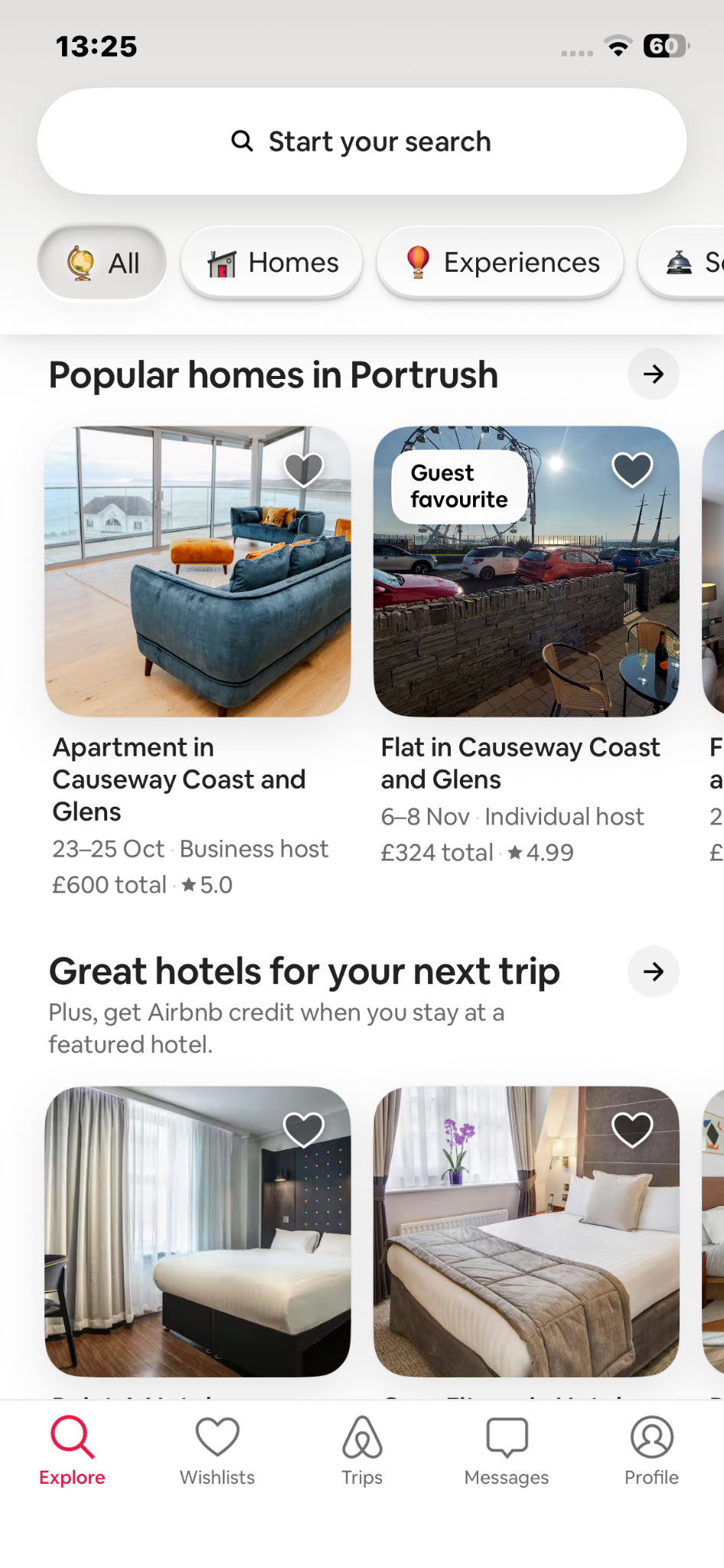
Explore, wishlists, trips, messages and profile remain accessible throughout the experience.
Visible category chips help visitors move from broad inspiration toward a relevant stay.
A single prominent “Book flight” button keeps the main journey easy to find.
The welcome message and AerClub login introduce a more personal starting point.
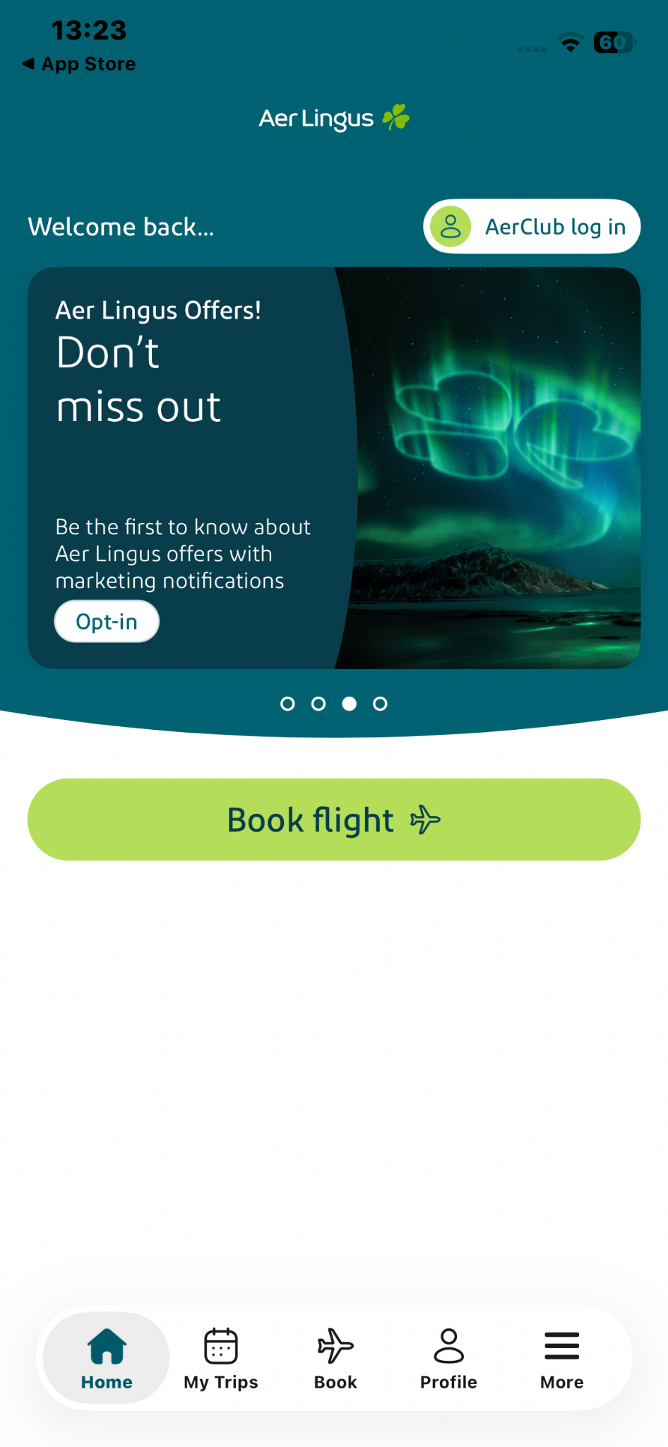
Generous space and limited choices reduce cognitive load compared with denser competitors.
Trips, booking, profile and more stay visible without competing with the main call to action.
Flights, stays, cars and packages are available immediately from one dashboard.
Explore and price-drop modules encourage browsing when users have no fixed destination.
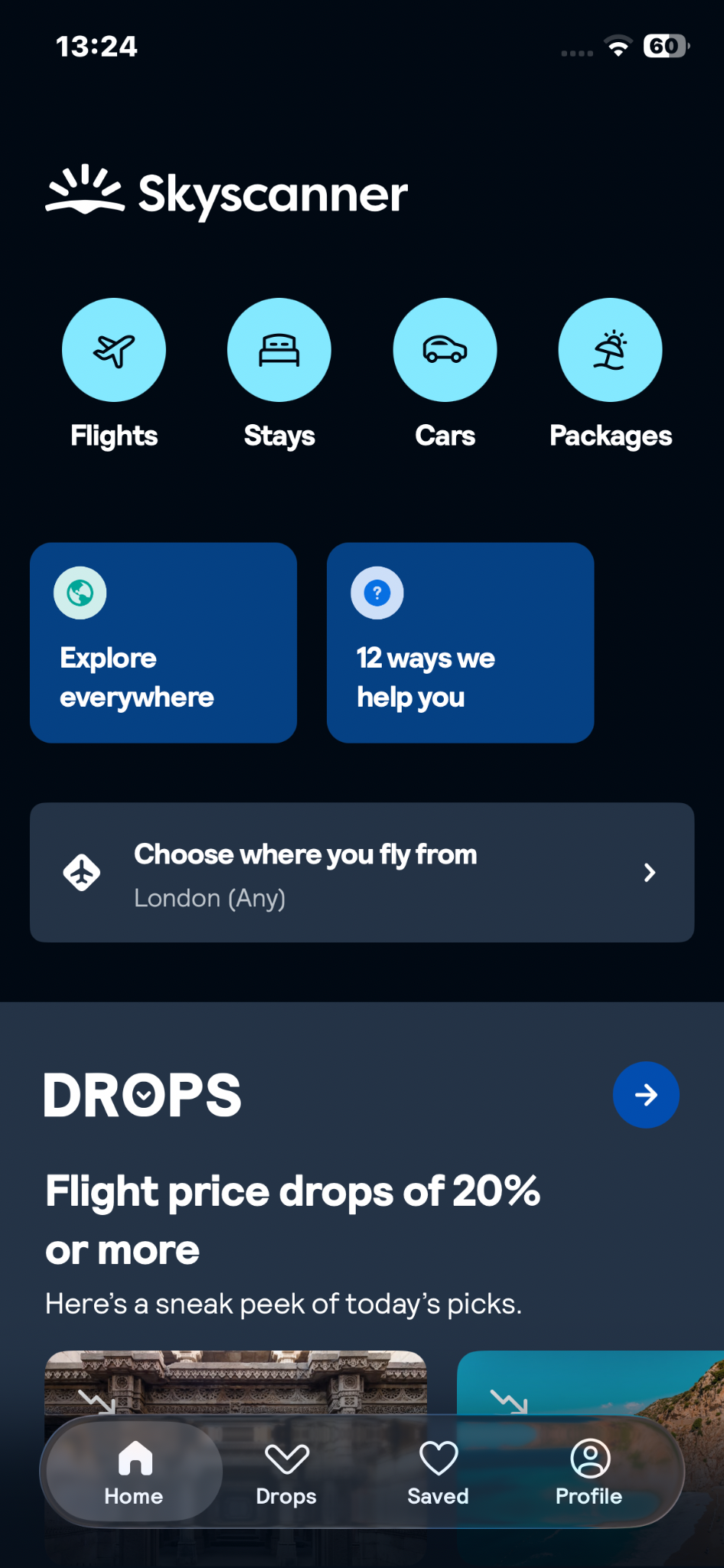
Strong grouping and contrast organise a large amount of content within the dark interface.
The departure selector gives recommendations a clear starting point before users search.
The large yellow “Book a flight” control makes the primary task unmistakable.
Large campaign banners compete for attention before the booking journey begins.
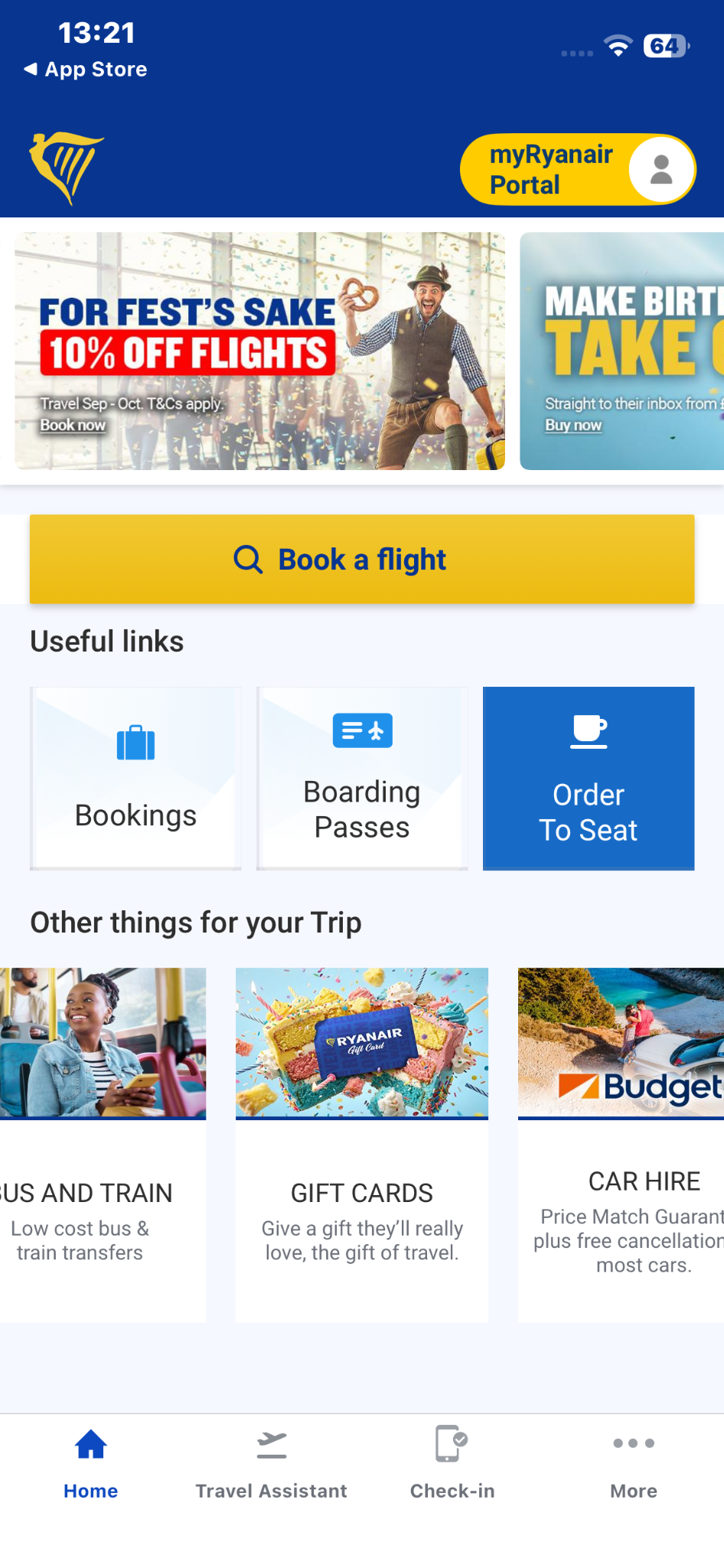
Bookings, boarding passes, transfers, gifts and car hire create a busy information hierarchy.
Home, travel assistance, check-in and more remain available at the bottom of the screen.
USER TESTING
Watching users revealed where the booking journey created hesitation and friction.
During usability testing I recorded participant behaviour, comments, difficulties and recurring patterns. These observations provided the raw research evidence used to identify usability issues within the booking journey.
View usability test in Figma ↗RESEARCH SYNTHESIS
Individual observations became clear patterns and shared priorities.
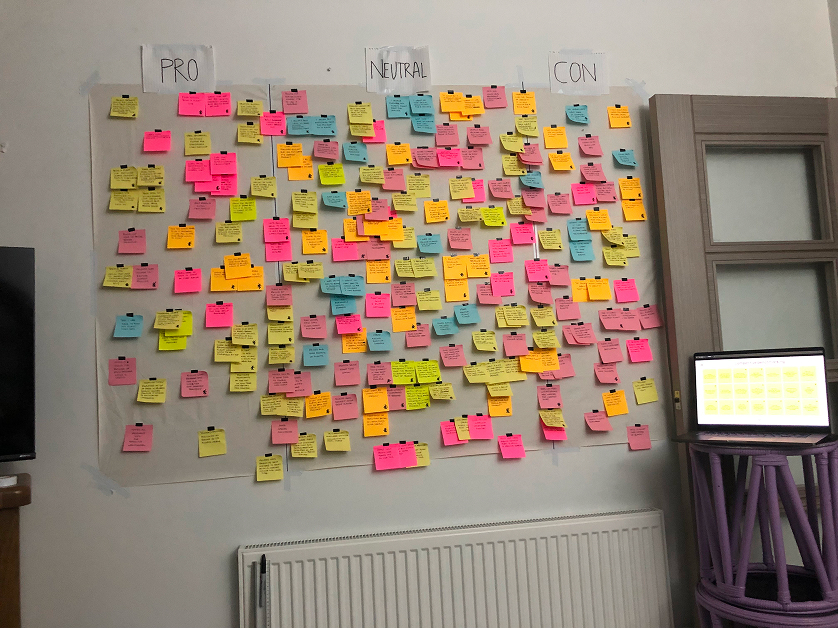
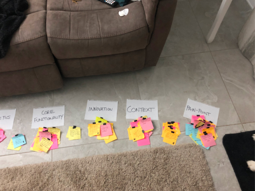
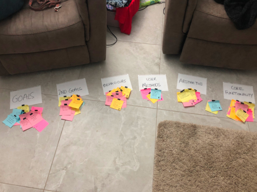
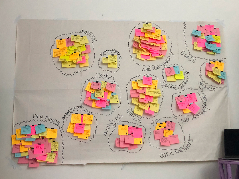
I grouped the observations gathered during note taking and usability testing to identify recurring behaviours, pain points, goals and patterns across participants.
View affinity diagram in Figma ↗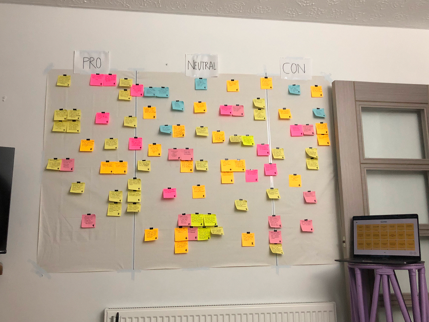
EXPERIENCE MAPPING
Mapping the full journey exposed the moments where NAVX could make travel feel simpler.
I translated the research findings into a customer journey map to understand the full booking experience from the user's perspective, including their actions, expectations, pain points and opportunities for improvement.
View journey map in Figma ↗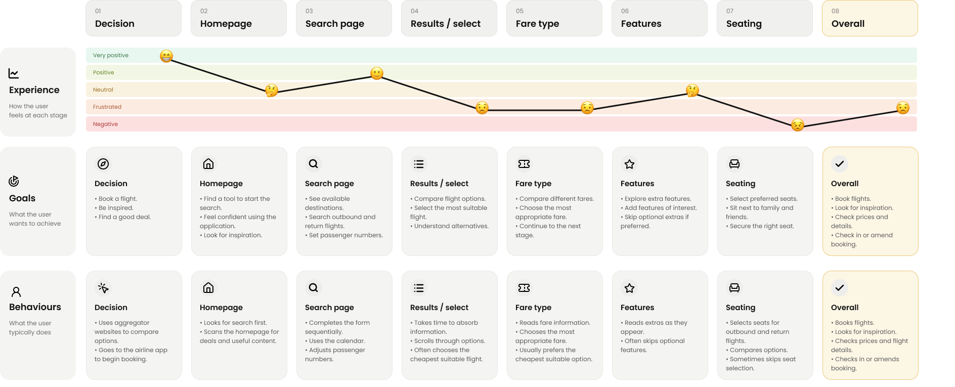
USER FLOW
A focused path turns destination discovery into a confident booking decision.
I mapped the key actions, decisions and transitions across the NAVX experience to remove unnecessary steps and keep the booking journey clear.
View flow diagram prototype in Figma ↗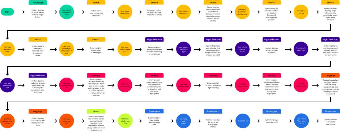
DESIGN DEVELOPMENT
Motion and feedback make the experience feel intuitive, cinematic and responsive.
The interaction system combines direct manipulation, clear feedback and purposeful transitions so every action feels connected to the journey.
View interaction design in Figma ↗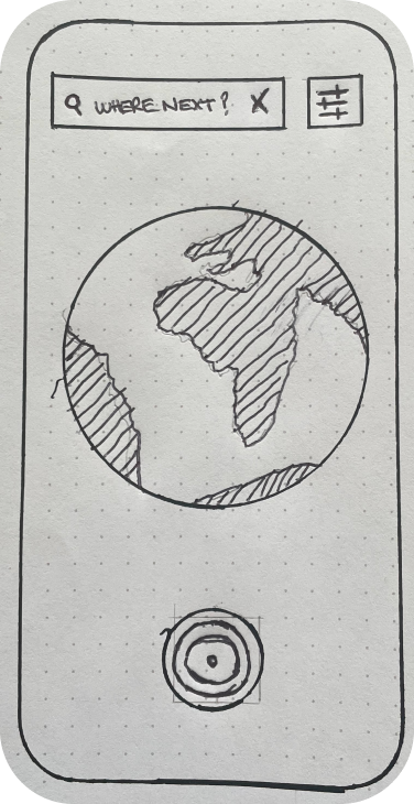
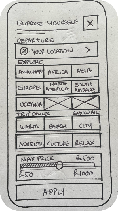
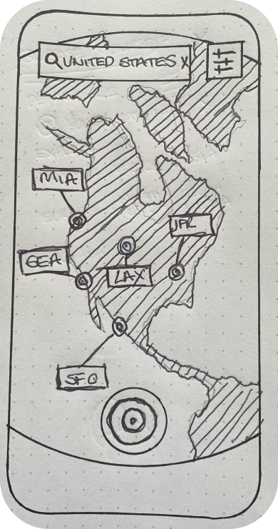
LOW FIDELITY
Testing the structure before refining the visual design.
I translated the research findings, journey map and flow diagram into low-fidelity wireframes to test the structure, hierarchy and core booking interactions before moving into the final interface design.
View low fidelity prototype in Figma ↗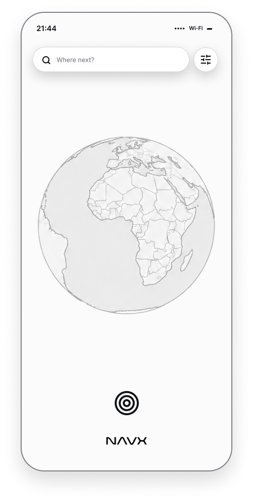
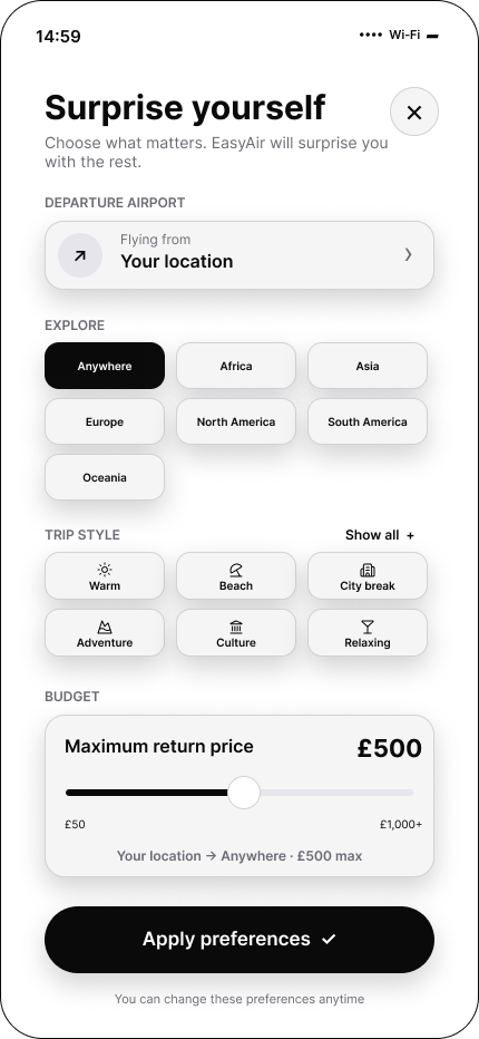
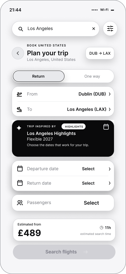
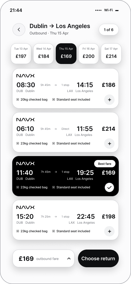
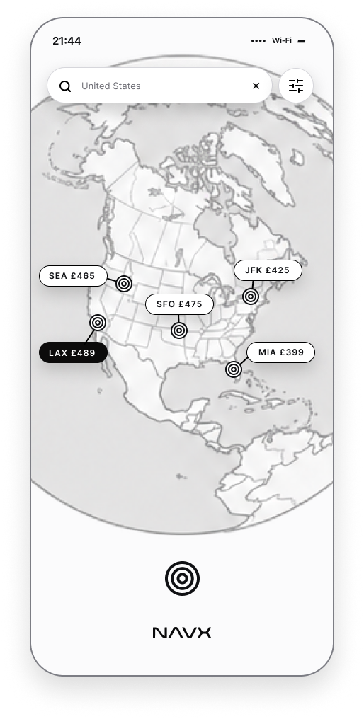
IMPLEMENTATION DETAIL
Defining how each interaction should behave before final implementation.
I documented the key controls, states and interactions across the NAVX booking journey, showing how the interface responds to user input and how each step connects through the experience.
View design specification in Figma ↗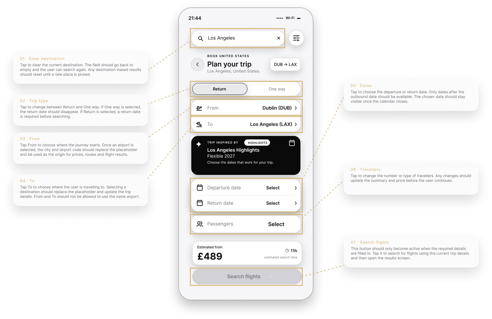
FINAL EXPERIENCE
Research and interaction design come together in one polished end-to-end experience.
Explore the working NAVX booking flow—from destination discovery and trip planning through flight, seat and passenger selection.